Sujean's EDCI 337 Blog

Author: sujeang

EDCI 337 Multimedia Design Group Project

How to Be Successful at University

Created by: Sujean, Darcy, Xinyi, and Thomas

Photo by Brooke Cagle on Unsplash

Overview

The transition from high school to university can be challenging. In contrast to high school, post-secondary education not only covers a broader spectrum of information but also delves deeper into each topic while incurring a heavier workload. In grade school, very rarely are students taught practical skills such as time management, organization, task prioritization, and personal deadline management.  These skills are typically developed on the student’s own time as they learn to navigate coursework; students often feel unprepared when undertaking this transition.

This lesson is designed to help students understand the strategies and skills that they can employ to help mitigate transitional challenges in university. As the objectives cover a handful of management skills, there are still many skills that are not mentioned in this lesson. By providing students with a foundational awareness of these useful skills, students will be prepared to continue learning and adopting more of these skills throughout their time in university.

Our group’s topic is “How to be Successful in University” for those who are transitioning from high school to university. We hope that the skills taught through our lesson are adopted by grade 12 students, and these skills make the transition smoother for them.

Let’s Get Started!

Before we dive into the main material, here is an infographic of the main ideas surrounding success tips at university:

EDCI 337 University Tips

Lesson Objectives

By the end of this week, you will be able to:

  • Describe what time management, organization, task prioritization, and  personal deadline management are,
  • Relate these subtopics to the overarching topic of “How to be Successful in University”,
  • Recognize, describe and apply the principles of each subtopic, and
  • Utilize practical applications of each subtopic (building personal to-do lists, personal calendars, segment time for assignments, etc.).

Read/ Watch 

Watch: How to Use Google Calendar (2022) (7:44 mins) – A great introductory video on the basic mechanisms of Google Calendar

Watch: How to Create Excel School Calendar with Automatic Date Maker (12:55 mins) – Introductory video for creating a calendar specifically for students

Read: Organization Strategies for Students (10 mins) – An article from Stanford University with tips for organization (physical and electronic)


Time Management

For the most part at university, there is typically a mountain of assignments but only a scarce amount of time.  By adopting good time management, you can ensure to achieve more and feel that your time has been spent more effectively. The main idea of good time management is that it helps produce increased productivity and efficiency in all of your work. Poor time management makes you believe that your tasks actually control how your day flows. However, effective time management occurs when you are actually in control of the tasks that you need to do (MindTools, n.d.).

A few tips to start practicing or improving your time management skill are the following:

  • Read the course syllabus first because it typically has a schedule of lessons taught and assignment due dates (MindTools, n.d.)
  • Make a to-do list (MindTools, n.d.)
  • Change your multitasking habit to focusing on 1 piece of work at a time (MindTools, n.d.)
  • Learn to delegate tasks in a group project (MindTools, n.d.)
  • Work out how much time is needed per task (MindTools, n.d.)

Learning Activity for Time management module: Student ‘A’ is a full-time high school student; he has a lot of activities that he wants to do for the coming school year. The activities include:

  • Working a part-time job at Thrifty Foods (15 hours per week)
  • Badminton practice (once a week for two hours per session)
  • Toastmasters (a public speaking club), twice a week for 1 hour per session

Please create a tentative weekly schedule for this student. On top of the required activities above, please also include time for him to sleep (8 hours every day) and do his homework (1 hour every day). Below is an example you may use for inspiration.

Grey Minimalist Weekly Calendar
Template retrieved from Canva

Organization Management

When school work piles up, school materials can be easily misplaced and lost. This ultimately comes down to how well organized you are with your physical surroundings as well as your technological surroundings. Organization management is another way to say how you organize your resources to ensure it benefits you and your work (The Business Professor, 2022). It’s a skill that allows you to oversee all of your own tasks; this gives you the opportunity to think about how you want to approach them. But it can also be applied to non-work related things such as staying tidy, organizing your books together, keeping a clean and comfortable environment, etc. The main idea of being good at organizing is that it allows you to be consistently productive in your work and saves you plenty of time that might’ve been used looking or thinking about something you did not organize prior. Ultimately assisting you down a path of success (The Business Professor, 2022).

Some useful physical organization skills that can be adopted are the following:

  • Documentation
  • Filing
  • Cleanliness

(Indeed, 2022).

Learning Activity for Organization Management Module:  Student ‘B’ has a group essay for her English class. Her group consists of herself, and two other students (Student ‘C’ and Student ‘D’). The essay must include an introduction, at least three paragraphs for the discussion, and a conclusion. The topic is of your choosing. Please create one document: delegation of tasks and roles.

Below is an example you may use for inspiration.

Orange Pastel Group Project Planner (1)
Template retrieved from Canva

Prioritization Management

It’s very common for learners to become overwhelmed with multiple tasks within a time frame;  to overcome this, an important skill is prioritization management. This strategy seeks to give learners empowerment in their queue of work through the strategic triage of work packages, as well as keeping an eye on the full span of ongoing workflows (Adobe, 2022). Learners trying to employ this skill should seek out work aspects like deadlines, depth of grading, expected time of completion, and marking weight to make informed decisions on which work to tackle over another; this kind of “triage” allows for a more strategic approach for ticking tasks off their agenda, which includes nuance in regards to the amount of time spent on a task, as compared to the relevant reward, or grading. A seasoned user of prioritization management will dedicate more time to larger assignments, and exams, as they’re aware that this takes prestige over “lower-priority” tasks.

This can be explained by the “Impact-effort Matrix”, which seeks to illustrate that the more impact a task will have, the more effort should be put in. It also highlights the interest that should be placed on “quick-wins”: which are described as tasks that are low-effort but produce a high return of impact (Gibbon, 2021). A major aspect of this approach ties in with the aforementioned time management: listing out applicable tasks, but then adding onto this by self-delegating the work depending on its perceived urgency, or ease of impact. 
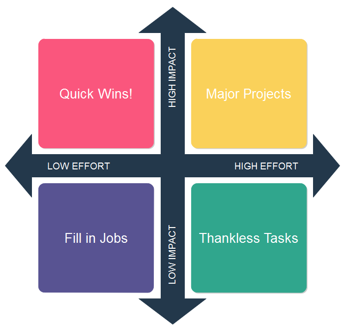
Impact v. Effort Matrix

Photo of Impact Effort Matrix by James Freeman on Edraw

Learning Activity for Prioritization management module: Student ‘E’ has multiple tasks that he needs to be completed today. These include: 

  • Cleaning his room
  • Laundry
  • An online quiz for his pre-calculus 12 class (worth 5% of his grade)
  • Editing and submitting an essay for his English (worth 10% of his grade)
  • Going Christmas shopping with his friends
  • Walking his dog (1-hour walk)
  • Volunteering at a soup kitchen (4 hours)

Below is an example you may use for inspiration. Please sort the listed tasks from highest to lowest priority based on the information given regarding each task.  Please also justify your list.

Beige Clean and Trendy Daily To Do List

Personal Deadline Management

Every student has heard that goal-setting habits are an extremely helpful and pertinent skill for staying on top of work and keeping healthy study/life habits: a niche within this method is self-derived deadline management. Personal deadline management, prioritization, and time management are all closely linked together. In order to meet academic and personal life responsibilities, priorities have to be in place, and you need to figure out the timing of each activity in relation to each other. Calendars are one effective tool to visually organize your personal deadlines.

Calendars can be created through Microsoft Excel or Google Calendar, or you can simply use the calendar on your personal device. On Google Calendar, you can color-coordinate your tasks, set reminders for tasks, and also easily share your calendar with others (https://workspace.google.com/products/calendar/). Staying focused on each task that is specified on your calendar can be very tiring. Therefore, one strategy is to create soft and hard deadlines. The inclusion of a soft reminder helps when tackling learning, as a well-placed notification somewhere along the project timeline acts as a minor deadline that will help offset the chance of falling behind on overall project work (Team Board, n.d.).

Although concentrating on the task at hand is important, coursework is a marathon, not a sprint. It’s important to include breaks in a timeline: mental drain and fatigue are major obstacles when a deadline is not constructed reasonably, and burnout will inevitably take away from usable work time. To touch on this further, if a self-set deadline is missed, it’s in the learner’s best interest to handle missed deadlines before they compound (Team Board, n.d.).

Learning Activity for Personal Deadline Module: Student ‘G’ has an individual project coming.  It is to create a blog post about a topic of their choosing. Please create a Gantt chart to help the schedule their project! Below is an example of a Gantt chart.

Blue Aesthetic Professional Gantt Graph
Template retrieved from Canva

Let’s Summarize everything with this interactive story!

Below is a sketch note providing additional tips!

sketchnote


Application

Now that we have covered four main topics of academic success factors at university, it’s time to apply your new knowledge!

In a  group of three, you will create a calendar for a hypothetical student who works part-time and is in grade 12. The calendar must be a realistic one while also trying to maintain a healthy lifestyle.
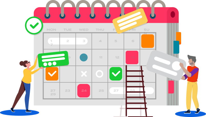
Setting Work Schedules: A Complete Guide for Managers

Photo of Effective Scheduling on TMETRIC

The specific details of the hypothetical student include:

  • Participates in weekly sports activity (one sport of your choosing, length of sports activity is your choosing)
  • Works 15 hours per week
  • Needs 8 hours of sleep per day

In combination with the project, please document soft deadlines that your group has set, task delegation, and a list of priorities for the group. You are free to use any calendar creation software.


Reflection Questions

  1. Provide an example of an organizational strategy that you would employ and explain how it would benefit you.
  2. Provide the definitions of task management and prioritization and why it is important in post-secondary education. How do these tie into time management?
  3. Why is time management important and how can these benefit university students?
  4. How can personal deadlines help contribute to a successful transition from high school to university?
  5. Why are these strategies important? Consider the context of the transition from high school to university. How do these strategies differ compared to what you employed in high school? What strategies do you currently use and how would you modify them (after learning these principles)?

To Do This Week

  1. Read/ Watch everything in this week’s post
  2. Complete the learning activities
  3. Start working on the assessment
  4. If the assessment is complete, complete a reflection on the assessment

Theories and Principles 

Below are some of Merill’s Principles of Instruction that were incorporated into our lesson:

  1. Learning is promoted when learners are engaged in solving real-world problems – Our lesson focuses on the real-life problem of management skills not being taught in grade schools. With this as the vocal point of our lesson, we engage students with real-life situations such as the group project scenario.
  2. Learning is promoted when existing knowledge is activated as a foundation for new knowledge- Our lesson is built upon our students’ understanding of time. In order to divide the day (24 hours) into the appropriate amount of time for each task, our lesson relies on our learners to know that time cannot go backward, there are 24 hours in a day, know that the units of time and to convert the units with each other.
  3. Learning is promoted when new knowledge is applied by the learner – After each subtopic is covered, the student is asked to participate in learning activities. Each learning activity is solely related to that topic (i.e. the topics are not cumulative for the learning activities). All the activities eventually lead to the final assessment.
  4. Learning is promoted when new knowledge is integrated into the learner’s world – The final assessment is a very realistic reflection of what the grade 12 students might face at university. Furthermore, these skills are taught not only apply to academics but also in the workforce and extracurricular activities.

Below are examples of how Mayer’s Theory of Multimedia Learning was used in our lesson:

  • Segmenting: The overarching topic of the lesson is broken down into four subtopics, this makes for a very natural “split” of the infographic real estate. Each subtopic contains a quick and easy piece of information that allows the user to understand in small portions.
  • Coherence principle (used for the infographic): Irrelevant images and text have been excluded to ensure simplicity. Consequently, every component of the infographic has high relevance to the topic without any distractions.
  • Spatial Contiguity (used for the infographic): Each image is placed beside its corresponding subtopic. As such, learners will not be confused as to what the image means and how it ties into the content. 

Below are examples of how Design Principles were used in the creation of our multimedia items:

  • Colour (used in the infographic and sketch note) – In the infographic, there is a consistent color scheme so that the color palette is not too overwhelming. The colors chosen do not obstruct the writing. Likewise, in the sketch note, there is also a consistent color scheme. By only having three colors, they are not too distracting from each other.
  • Hierarchy (used in the infographic) – The size of the text is from biggest to smallest; this alerts the reader where the most important information is. This provides a logical flow of information for the reader
  • Balance (used in the infographic) – The alignment of the graphics alternate so there is an overall balance in the infographic. Nothing is heavily on the left side nor heavily on the right side.

Final Lesson Plan and Final Project Plan

Final Project Plan and Lesson Plan

References

  1. Adobe. Adobe Communications Team. Priority Management: A Complete Guide to Managing Priorities. (2022, March 18). https://business.adobe.com/blog/basics/priorities-management
  2. Freeman, J. Edraw. Editable impact effort matrix templates.  (March 9, 2021). https://www.edrawsoft.com/impact-effort-matrix-templates.html
  3. Gibbon, Sarah. Nielsen Norman Group. 5 Prioritization Methods in UX Roadmapping. (2021, November 14). https://www.nngroup.com/articles/prioritization-methods/
  4. Greenwood, J. (n.d.). Merrill’s First Principles of Instruction. James Greenwood. https://www.james-greenwood.com/instructional-design/toolkit/merrill/#:~:text=The%20premise%20of%20Merrill%E2%80%99s%20first%20principles%20of%20instruction,principles%20are%20necessary%20for%20effective%20and%20efficient%20instruction.%E2%80%9D%28p44%29
  5. MindTools. Mind Tools Content Team. What is Time Management (n.d.). https://www.mindtools.com/arb6j5a/what-is-time-management
  6. Indeed. Organizational skills: 10 types and how to improve them. (June 16, 2022). https://www.indeed.com/career-advice/career-development/organization-skills
  7. Team Board. Why are Deadlines important? Know the Effective Way of Deadline Management. (n.d.). https://www.teamboard.cloud/deadline-management/
  8. The Business Professor. Organizing function of management – explained. (October 5, 2022). https://thebusinessprofessor.com/en_US/management-leadership-organizational-behavior/what-is-the-organizing-function-of-management
  9. TMETRIC. Setting work schedules: A Complete Guide for managers. (2022). https://tmetric.com/work-schedules
  10. Unsplash. Free images and pictures. (March 27, 2018). https://unsplash.com/photos/g1Kr4Ozfoac
  11. Watt (2022). W-2: How Do We Learn? https://edtechuvic.ca/edci337/2022/08/29/w2-how-do-we-learn/
  12. Watt (2022). W-5: Design Principles for Multimedia Presentation. https://edtechuvic.ca/edci337/2022/10/02/w5-design-principles-for-multimedia-presentations/

 

EDCI 337 Blog Post 9

Photo by Glenn Carstens-Peters on Unsplash

This week, I explored a new software called Twine. According to the official Twine website,  it is “an open-source platform for telling interactive, nonlinear stories” (https://twinery.org/). It can be thought of as an online platform for creating your own adventure stories.

While playing around with Twine, I created my own story. I based my story on the objective of teaching students the importance of time management, prioritization, and organization. Please feel free to view my story below.

My Twine Story

Gamified Learning Activity Elements

Twine is very similar to an online game. A few gamified learning activity elements involved include the following:

  • Narrative – The story begins with setting up the player as a first-year university student tasked to navigate their way through planning a group project.
  • Immediate Feedback – With each choice that the player makes, they are given feedback.
  • Player Control – The beauty of a twine story is that the outcome is completely dependent on the choices that the player makes.

Student Activity Using Twine

I think there are multiple ways to utilize Twine in learning. One student activity can be to have students learn about a certain concept through readings and youtube videos then create a Twine story from their learning.  For example, they can learn how Chinese workers influenced the creation of the Canadian Pacific Railway. The next step is to have them create a Twine story that is inspired by what they learned.

Although Twine was relatively easy to learn, I did have some troubleshooting problems when trying to solve my errors. It does take a lot of patience and problem-solving on the creator’s part because each passage needs to make logical sense.  Therefore, I think Twine is more appropriate for middle-school-aged students. Furthermore, I think that Twine can be used both in a creative sense but also in a technological sense. Twine uses HTML, Javascript, and CSS to create its stories. Through manipulation of each of the languages, creators can see how it affects the outcome. It teaches very basic coding and conditional logic.

EDCI 337 Core Multimedia Skills Blog

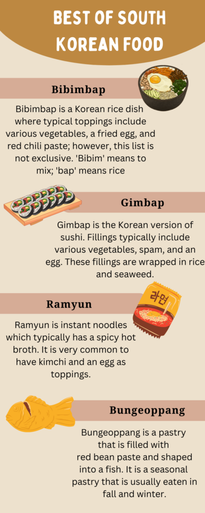
Throughout this term, I learned various learning principles and theories such as Mayer’s multimedia learning principles, and Principles of Universal Design for Learning. By employing these principles, learning can be more engaging for the learner even through online delivery.  A few weeks ago, I created an infographic that illustrates popular South Korean dishes.  I have re-evaluated my work,  and I have updated my infographic by incorporating newly learned multimedia principles Through my infographic, I hope people learn how diverse the South Korean food flavor profile is.

My original infographic:

What I decided not to change, and why:

  • Infographic Layout
    •  I kept the alignment of my content the same in order to make sure that the overall infographic is balanced. I created balance, by alternating the placement of the headings. Balance is important because it creates a sense of cohesiveness.
  • Color scheme
    • I kept the color scheme (neutral brown tones) because South Korean food is fundamentally simple in nature. In addition to the former reason, I also did not want to add any more colors because I thought it would throw the overall infographic off balance. By not adding extra colors, I kept to Meyer’s coherence principle. That being said, I chose two different shades of brown to distinguish them from each other. Having a lighter brown as the heading for the food names signals the viewer to the name of the dish. This aligns with Mayer’s signaling principle.

Updated Infographic:

What did I change, and why?

  • Content Background
    • I decided to add a white background to my main content because I wanted the content to be obvious.  If I added a white background, then it would signal my learner towards the main information. In this case, I adopted Meyer’s signaling principle. I chose white because it was bright enough to contrast against the beige poster background.
  • Content Visualization
    • In order for the information to be delivered in a more simple format, I updated the main information from the full-sentence form to bullet point form. By having the information in bullet points, it is more concise and straightforward. This change aligns with  Mayer’s redundancy principle.
  • Pronunciation
    • While updating my infographic, I realized that most people would not know how to pronounce the names of Korean food. This could have posed a barrier for dyslexic individuals and those not familiar with the Korean language. In order to overcome this barrier, I added the phonetic sounds of the names of each dish. In terms of the Universal Design Principles, this was an attempt to adopt the representation guideline.

References:

Mayer’s principles retrieved from: https://waterbearlearning.com/mayers-principles-multimedia-learning/

Universal Design for Learning retrieved from: https://udlguidelines.cast.org/

EDCI 337 Blog Post 8 – Interactivity with H5P

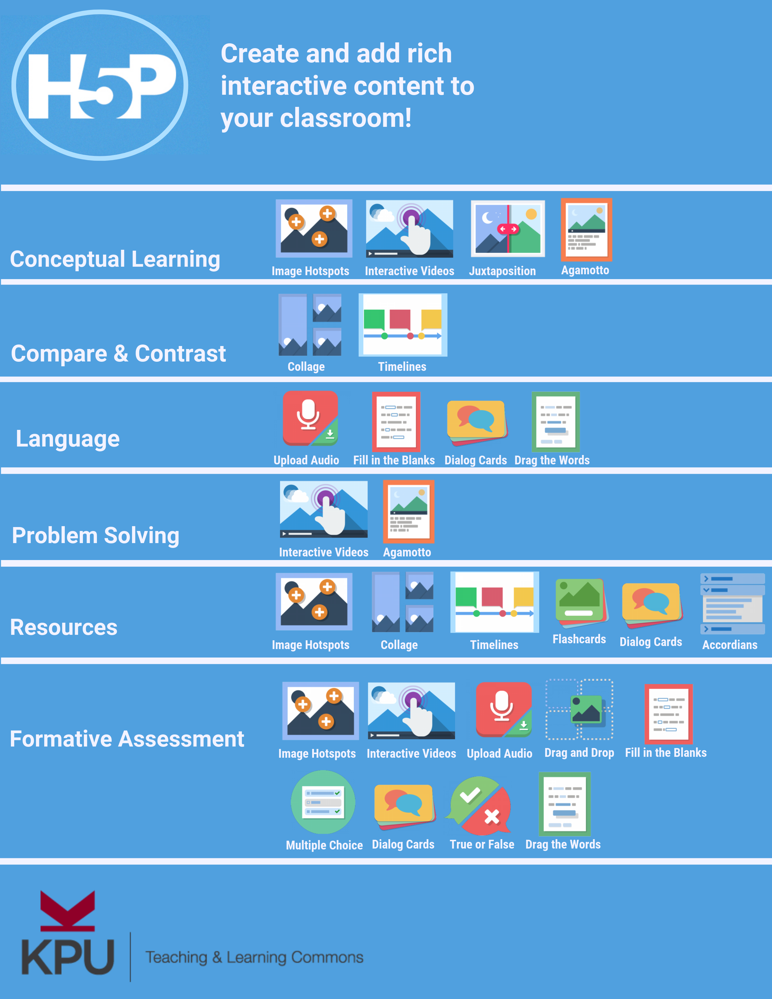
Image retrieved from  Kwantlen Polytechnic University, Teaching & Learning Centre

What is H5P?

H5P is “a free, versatile, open source authoring tool integrated with WordPress and many other platforms that allow you to quickly create, share and reuse a wide variety of interactive and engaging learning activities” (Watt, 2022, W-9). Some activities include multiple-choice questions, true or false questions, fill-in-the-blank questions, drag-and-drop, image hotspots, and branching scenarios. (Watt, 2022, W-9).


Prompt:

What was your experience of trying H5P? Which of the activities do you think you would make the most use of in your teaching context and what would you use them to do? Which ones do you think require the most resources to create?


My First Experience with H5P

While playing around with H5P, I thought ‘why didn’t my teachers ever use this to teach my class?’. H5P was user-friendly, however, intuitive to learn. The icons to embed activities were simple and easy to find.  While playing around with the activities, I would occasionally add a feature that I did not mean to. However, all I had to do is click on the trash can icon to undo my mistake.

The hardest part was determining the timing of my activities within my video. I wanted my activities to pop up at a natural time so that the activities would be cohesive with the video. I had to edit the timing of the activities right down to the milliseconds.

First H5P attempt:

How a student changed her study habits by TEDxTalks (2019): https://www.youtube.com/watch?v=z7e7gtU3PHY


Most used activities

I think all of the activities from H5P would be great to incorporate as interactive activities in a classroom setting. However,  the ones that I found that I gravitated towards the most were the multiple-choice questions and the True and False questions. I think I used these two activities the most because they are the ones that I have personally used the most while in school; I had a sense of familiarity with these forms of assessment. That being said, both activities are great ways to test a student’s knowledge because the different options can trigger a student to be distracted by the multiple choices; multiple choice and true and false are more than just guessing games. They test if the student was retaining the information and if they really paying attention.

Out of the two activities, I think the multiple-choice questions require more resources. Since there needs to be more than one choice, the options that are the wrong choice cannot be too obvious that they are incorrect because that would be too easy for the student. However, multiple choice questions do encourage the student to think critically because most of the time they would most likely think logically to settle on one choice.


Connection with Theories and Principles

Below are some examples of how Mayer’s Theory of Multimedia Learning  was used in the H5P activity:

  • Segmenting (Watt, 2022, W-3): Within the interactive video, instead of having all the questions in one section of the video, I placed the questions evenly dispersed. By doing it this way,  it forces the watcher to be engaged with the video until the end. Furthermore, it prevents the watcher from being overly stimulated since there are breaks between the questions.
  • Signaling (Watt, 2022, W-2): Throughout the interactive video, pop-up questions appear.  The questions clearly signal to the watcher that it’s time to complete the short quiz. There is no confusion as to where to click in order to answer the questions.

What I wish were different

While going through my H5P activity again, I noticed a few things that I wish I could incorporate:

  • Closed-Captioning options: The video that I used was from YouTube. On Youtube, the viewer has the option to turn on/off closed-captioning. However, while playing my interactive video, I noticed that option is no longer available. I think it would be very beneficial to have closed-captioning in multiple languages. This would be helpful for hard-of-hearing individuals, English Language Learners, and many more. Having one improvement can benefit many; this aligns with the UDL principle of representation (UDL, 2022). 
  • Voice to Action: While interacting with the interactive video, I thought it would be cool if individuals could interact not solely by clicking the screen. For example, individuals who have a physical disability with their arms, most likely could not easily use a mouse very easily; therefore, they could not participate in H5P activities. Instead, by using their voice and clear instructions, perhaps they could participate in the activities. This reflects the UDL principle of Action and Expression (UDL, 2022).

Additional H5P Activity


Reference:

TEDxTalks. (2019). How a student changed her study habits [Video]. YouTube. https://www.youtube.com/watch?v=z7e7gtU3PHY

UDL. (2022, September 2). The UDL guidelines. Retrieved https://udlguidelines.cast.org/ 

Watt (2022). W-2: How Do We Learn?. Retrieved from: https://edtechuvic.ca/edci337/2022/08/29/w2-how-do-we-learn/

Watt (2022). W-3: Multimedia Design For Learning. Retrieved from: https://edtechuvic.ca/edci337/2022/09/17/w3-multimedia-design-for-learning/

Watt (2022). W-9: Active and Passive Learning. Retrieved from: https://edtechuvic.ca/edci337/2022/10/29/w9-active-and-passive-learning/ 


EDCI 337 Blog Post 6 – Storytelling

In the reading this week, 7 Storytelling Techniques Used by the Most Inspiring TED Presenters, which of the presenters did you find most compelling? What technique(s) did you recognize in their talk?

The presenter I found most compelling was Leslie Steiner’s story of “domestic violence and how she found the courage to leave her abusive spouse” (7 storytelling techniques used by the most inspiring ted presenters, 2022).

I was attracted to Leslie’s story because of her story started about domestic abuse started around the same age as me. Furthermore, as a young woman myself, I found her situation can happen to me too.

Leslie Morgan Steiner, “Why domestic violence victims don’t leave”: https://www.youtube.com/watch?v=V1yW5IsnSjo

A few storytelling techniques were used:

  • Tell a personal story: Leslie opened up her personal story of surviving domestic abuse with sensitive details such as how her ex-husband choked her so tightly she could not even scream or breathe (7 storytelling techniques used by the most inspiring ted presenters, 2022).
  • Create suspense: Leslie started the presentation off by saying “I’m here to talk about a disturbing question, which has an equally disturbing answer” (7 storytelling techniques used by the most inspiring ted presenters, 2022). The key word in this sentence that created suspense is disturbing. Starting the presentation like this engages the audience because they will anticipate the story that will follow up.
  • End with a positive takeaway: Leslie concluded her presentation by sharing her current happy home life with her second husband, three children, and their pet dog. She further encourages that domestic violence needs to be talked about more and that there can be a happy future for victims.

Practicing Storytelling

This week, I had an opportunity to practice my storytelling techniques. In alignment with this course, I was instructed to tell a story with a learning purpose. The topic that I chose was Tips and Tricks to practice a new language. In order to practice my techniques, I created a storyboard: Practicing a new language. This storyboard also includes the story script. I had a lot of fun creating this storyboard because I personally used these tricks to learn Korean at home.

References:

7 storytelling techniques used by the most inspiring ted presenters. Visme Blog. (2022, September 27). Retrieved October 21, 2022, from https://visme.co/blog/7-storytelling-techniques-used-by-the-most-inspiring-ted-presenters/

EDCI 337 Blog Post 5

Where do you see constructive alignment and backward design used in this course or another course you are taking/ have taken? Is there anywhere where it seems to be missing?

Constructive Alignment and Backward Design are two tools used to design a lesson. Constructive alignment means that the learning outcomes, assessments, and activities are all aligned with each other (Biggs). Whereas, backward design is when the lesson plan is constructed with the end goal in mind (learning outcome), then working from there to design the activities and assessment (Richards, 2013).

While taking this course ( EDCI 337), I have seen numerous applications of constructive alignment and backward design. For example, during the week 5 lesson, learning outcomes/objectives are clearly stated at the top of the blog. Following this, resources for the lesson are provided. This section aligns with providing the activities. Lastly, is the assessment section. The assessment was in the form of a blog post while commenting on another peer’s post, and creating an infographic using the design principles. Constructive alignment was also used in the lesson since the objectives, activities, and assessment all related to the core idea of design principles for multimedia presentations.

EDCI 337 Week 5 lesson: https://edtechuvic.ca/edci337/2022/10/02/w5-design-principles-for-multimedia-presentations/

Lesson Design Planning- The Korean Alphabet

Big Idea: The Korean alphabet is the foundation of the language

Learning Outcomes: By the end of this lesson, you will be able to write and pronounce each letter of the Korean alphabet

Evidence of Learning: A visual reenactment of the use of the letters of the alphabet and pronunciation.

Assessment: A video of the student using parts of their body to display each letter of the Korean alphabet. They must also sound out each letter as they display them

Learning Activities: Watch a video about the Korean alphabet: how to write and pronounce each letter.

References

Biggs, John, Constructive Alignment in University Teaching, HERDSA Review of Higher Education Vol. 1, www.herdsa.org.au

Richards, J. C. (2013). Curriculum approaches in language teaching: Forward, central, and backward design. Relc Journal44(1), 5-33.

EDCI 337 Blog Post #4

Which design principles did you use to create your infographic in Canva? Which design elements of a ‘good infographic’ were you able to incorporate? What other principles did you consider?

For this week’s blog post, I decided to create an infographic. Infographics are visual representations of a certain topic that incorporates visual keys and minimal text. However, design is an important component of infographics since the information should be intriguing for the reader while being informative.

In order to create my infographic, I got in touch with my Korean heritage. Korean food has various flavour profiles which I wanted to showcase to my class.

In order to create the infographic, I tried to incorporate various design principles. When creating an infographic, design principles are vital to keep in mind. Below are the 8 basic design principles:

  • Focus on alignment
  • Use hierarchy to help focus your design 
  • Leverage contrast to accentuate important design elements
  • Use repetition to your advantage
  • Consider proximity when organizing your graphic elements
  • Make sure that your designs have balance
  • Optimize colour to support your design
  • Leave lots of negative space

(Adobe Express, 2020).

Some design principles that were utilized in the infographic are the following:

  • Hierarchy: The size of the text from biggest to smallest alerts the reader where the most important information is
  • Repetition: Consistent format of the layout of the information is used
  • Balance: The alignment of the graphics alternates so there is an overall balance in the infographic
  • Colour: There is a consistent colour scheme (a couple of brown shades, black, and white) so that the colour palette is not too overwhelming

Infographic:

Best of Korean Food Infographic: https://www.canva.com/design/DAFOS6rKXRA/64vMcAdL7jv8ZQbL9xJE0w/view?utm_content=DAFOS6rKXRA&utm_campaign=designshare&utm_medium=link&utm_source=homepage_design_menu

References:

Adobe Express, (2020, Oct 17). 8 basic design principles to help you make Awesome Graphics. Adobe. https://www.adobe.com/express/learn/blog/8-basic-design-principles-to-help-you-create-better-graphics

EDCI 337 Blog Post 3

What does inclusive design mean to you?

When I think of inclusion design, I think of a design that is accessible to as many people as possible. For example, a design that can cater to color blind individuals, deaf/hard of hearing individuals, blind individuals, English as a Second Language (ESL) individuals, and/or low technology literacy individuals.

Inclusion Picture from Unsplash: https://pixabay.com/illustrations/inclusion-group-wheelchair-2731340/

Touching on the topic of inclusion, a few principles taught this week highlight how inclusion can be maximized:

  1. Recognize Exclusion = Identifying the extremes and trying to remove as many barriers to accommodate for the extreme cases
  2. Solve for One, Extend to Many = One solution can be utilized for multiple situations
  3. Learn from Diversity = Testing with as many different kinds of people

I don’t think there is one product that can be used universally, however, the principles above definitely provide ‘food for thought’ when designing a product or lesson plan. Perhaps, it would be easier to have multiple items that target certain groups of individuals. For example, kids who are hard of hearing can have live transcripts of the lesson.

EDCI 337 Week 2 Blog Post

Principles of Cognitive Theory of Multimedia Learning

Most Intuitive – The Coherence Principle

The coherence principle allows designers to create projects that align with their topic; it also prevents them to add extraneous visuals, sounds, and text. I feel like this is the most intuitive principle because I feel that many people start by solidifying their topic before diving into their project.

For example, if a University of Victoria student is preparing a presentation about eagles, she may use the following image and video:

https://pixabay.com/photos/adler-eagle-bird-white-tailed-eagle-2386314/
https://www.youtube.com/watch?v=N-DikVjBI_s

Since these items are on the same topic and do not distract from each other, they would make the presentation coherent.

Most surprising – The Signaling Principle

The signaling principle uses visual and auditory signs to draw the viewers’ attention to certain areas of the screen. I found this principle the most surprising because I feel that not a lot of presenters use this principle. I think that if educators learn to effectively use this principle then students will be more engaged with their learning.

EDCI 337 Week 1 Blog Post

What made you decide to take this course?

As a health information science student, I learn how to incorporate technology into healthcare practices. I wanted to take this course to learn how multimedia could perhaps enhance technology acceptance.

What is interactive media?

Interactive media is media that is affected by the user’s interaction. One example is a mobile phone game called Subway Surfers. The movement of the character depends on the motions of the user. For example, if the user swipes up on their phone, then the character jumps.

Subway Surfers: https://www.mobygames.com/game/iphone/subway-surfers/screenshots/gameShotId,563777/ (Mobygames, n.d.)

What is multimedia?

Multimedia is a mix of two or more types of media within one project. An example of multimedia is movies. Movies combine visuals (ie graphics) and sounds.

What is interactive multimedia?

Interactive multimedia is a combination of at least two media forms while changing its outputs according to inputs from the user. An example of interactive multimedia is virtual reality (VR) games. VR games incorporate graphics, sounds, and some written media. The game changes as the user interact with it. For example, when a user swings their arm diagonally in Fruit Ninja, then the fruit explodes.

Fruit Ninja Virtual Reality Game: https://www.youtube.com/watch?v=hPY4TRRHwZc (PlayStation, 2016)

References

PlayStation. (2016, December 20). Fruit Ninja VR – gameplay trailer | PS VR. YouTube. Retrieved September 16, 2022, from https://www.youtube.com/watch?v=hPY4TRRHwZc

Subway surfers screenshots for iPhone. MobyGames. (n.d.). Retrieved September 16, 2022, from https://www.mobygames.com/game/iphone/subway-surfers/screenshots/gameShotId,563777/