Throughout this term, I learned various learning principles and theories such as Mayer’s multimedia learning principles, and Principles of Universal Design for Learning. By employing these principles, learning can be more engaging for the learner even through online delivery. A few weeks ago, I created an infographic that illustrates popular South Korean dishes. I have re-evaluated my work, and I have updated my infographic by incorporating newly learned multimedia principles Through my infographic, I hope people learn how diverse the South Korean food flavor profile is.
My original infographic:
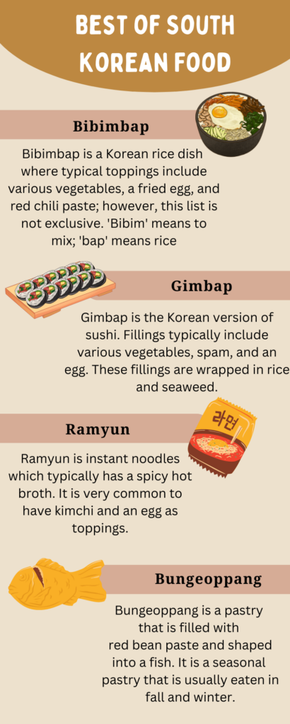
What I decided not to change, and why:
- Infographic Layout
- I kept the alignment of my content the same in order to make sure that the overall infographic is balanced. I created balance, by alternating the placement of the headings. Balance is important because it creates a sense of cohesiveness.
- Color scheme
- I kept the color scheme (neutral brown tones) because South Korean food is fundamentally simple in nature. In addition to the former reason, I also did not want to add any more colors because I thought it would throw the overall infographic off balance. By not adding extra colors, I kept to Meyer’s coherence principle. That being said, I chose two different shades of brown to distinguish them from each other. Having a lighter brown as the heading for the food names signals the viewer to the name of the dish. This aligns with Mayer’s signaling principle.
Updated Infographic:
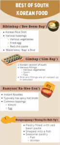
What did I change, and why?
- Content Background
- I decided to add a white background to my main content because I wanted the content to be obvious. If I added a white background, then it would signal my learner towards the main information. In this case, I adopted Meyer’s signaling principle. I chose white because it was bright enough to contrast against the beige poster background.
- Content Visualization
- In order for the information to be delivered in a more simple format, I updated the main information from the full-sentence form to bullet point form. By having the information in bullet points, it is more concise and straightforward. This change aligns with Mayer’s redundancy principle.
- Pronunciation
- While updating my infographic, I realized that most people would not know how to pronounce the names of Korean food. This could have posed a barrier for dyslexic individuals and those not familiar with the Korean language. In order to overcome this barrier, I added the phonetic sounds of the names of each dish. In terms of the Universal Design Principles, this was an attempt to adopt the representation guideline.
References:
Mayer’s principles retrieved from: https://waterbearlearning.com/mayers-principles-multimedia-learning/
Universal Design for Learning retrieved from: https://udlguidelines.cast.org/
Recent Comments